![]()
Visualization area
The visualization area is the main display of module Transition analysis. It consists in six tabs, each showing different analysis-related data.
Use this area to visualize overall data histograms, fit results and kinetic model estimation.
Any graphics in MASH-FRET can be exported to an image file by right-clicking on the axes and selecting Export graph.
Area components
TDP
Use this tab to visualize the TDP and clustering results or to modify cluster color code.
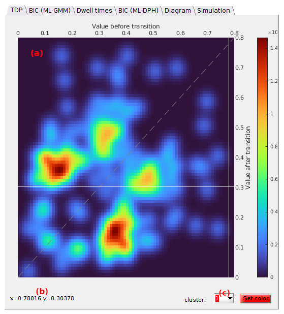
The axes in (a) display the TDP according to the stage the transition analysis is at. Transition densities are color-coded according to the user-defined Color map shown by the scale located on the right hand side of the axes.
When hoovering the axes with the mouse, a crosshair indicates the position on the x- and y-axis and mouse coordinates are shown in (b).
Cluster colors can be modified by selecting the cluster index in list (c) prior opening the color picker by pressing
 .
.
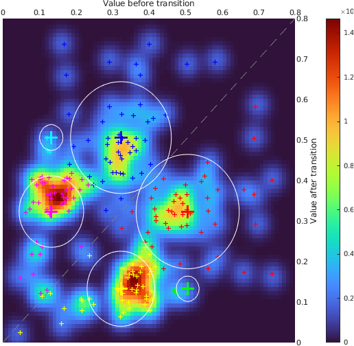
Clusters
After completing TDP clustering, clustered transition are indicated by cross markers that are colored according to the defined cluster colors and the contour of each cluster is plotted as a white solid line.
BIC (ML-GMM)
Use this tab to visualize the BIC calculated for each model complexity tested in GM clustering.
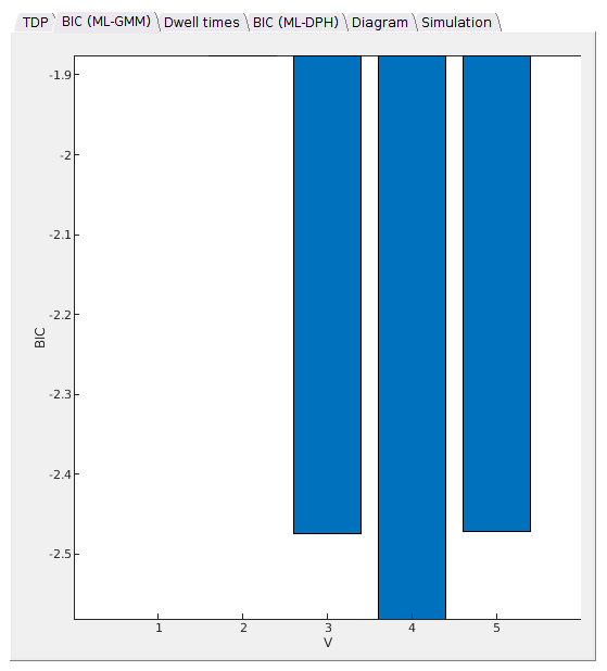
This bar plot shows the BIC values obtained for Gaussian mixture clustering in panel State configuration in function of the model complexity V. The most sufficient model complexity Vopt yields the minimum BIC.
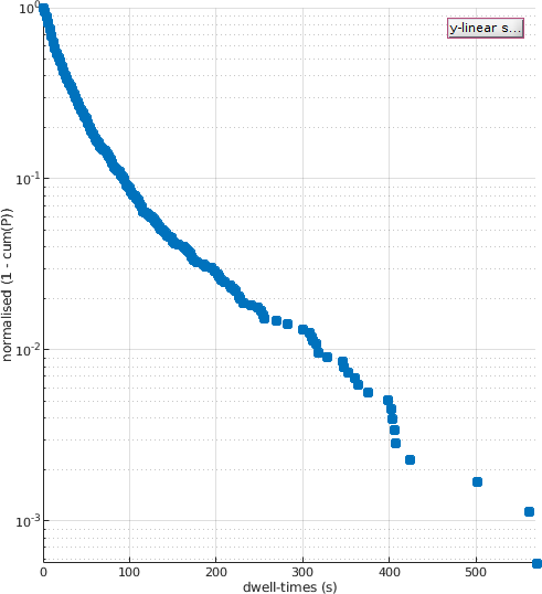
Dwell times
Use this tab to visualize the cumulative dwell time histogram and fitting results.
The histogram plot depends on the Fit settings and the stage the transition analysis is at.
Default
Just after TDP clustering, the cumulative and complementary dwell time histogram corresponding to the dwell time set selected in the State list is plotted with blue solid markers.
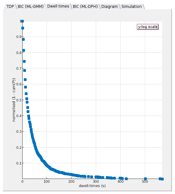
To identify potential multiple decays, the dwell time histogram can be visualized on a semi-log scale by pressing
 .
.
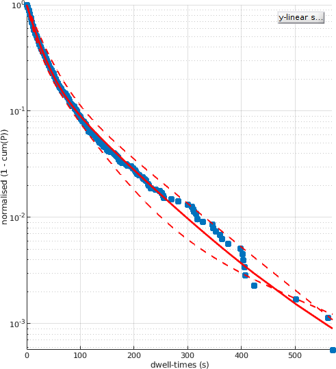
After fit
After performing exponential fitting, the resulting fit function is plotter over the histogram as a solid red line.
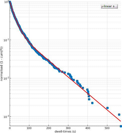
When the Fit settings include bootstrapping, the exponential function built with bootstrap means of the fitting parameters is plotted as a red solid line.
Exponential fit functions giving the lowest and highest lifetimes are plotted in dotted lines. This gives an visual estimation of the cross-sample variability of state lifetimes.
BIC (ML-DPH)
Use this tab to visualize model selection on discrete phase type distibutions.
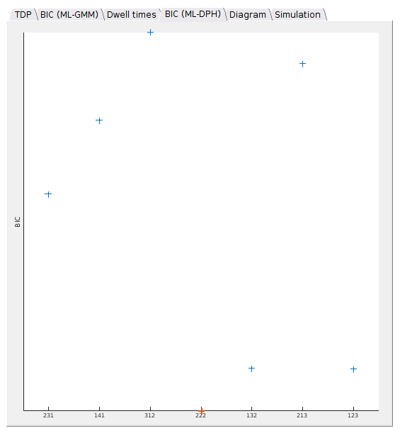
If the method used in
State degeneracy is ML-DPH, the resulting BIC values are shown by blue cross markers against the respective model complexities, with the most sufficient complexity being shown in red.
A degeneracy 121 means that one state (1) yields the first observed value in the
State list, two (2) yield the second, and one (1) the third.
Diagram
Use this tab to visualize the final kinetic model, depending on the stage the analysis is at.
Once the observed state configuration and state degeneracies are resolved, the final degenerate state configuration is shown as a treillis diagram. States are depicted by circles labelled in red with the observed state values.
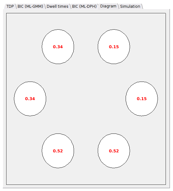
After estimation of transition rate constants
After estimation of transition rate constants, the radii of circles are determined by the relative state populations calculated from Simulation, and state transitions are shown by black arrows which thickness depend on the number of transitions obtained in Simulation.
State lifetimes calculated from the diagonal terms of the inferred transition probability matrix are shown in blue.
![]()
Transition probabilities lower than 1/L0, with L0 the total number of data points in the experimental trajectory set, are not represented.
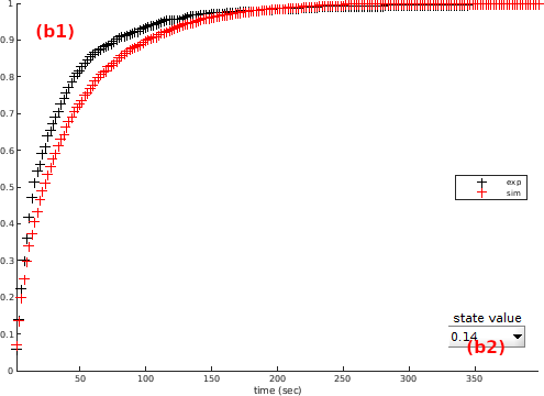
Simulation
Use this tab to compare experimental data with simulation from inferred kinetic parameters.
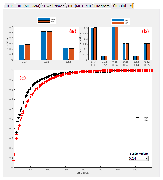
Four plots are presented in three axes:
- (a)
Pop. - (b)
Trans. - (c)
Dwell times
Pop
Experimental populations of observed states (in blue) are compared to simulation (in red).
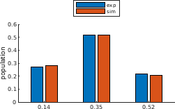
State populations are calculated as the sum of corresponding dwell times.
Trans
Experimental number of transitions between observed states (in blue) are compared to simulation (in red).
![]()
Dwell times
Experimental normalized cumulated dwell time histograms of the observed state selected in (a) (in blue) is compared to simulation (in red).